Fans tuning into the Mexican Grand Prix on Sunday were treated to more tyre information than ever before thanks to a brand-new on-screen tyre performance graphic.
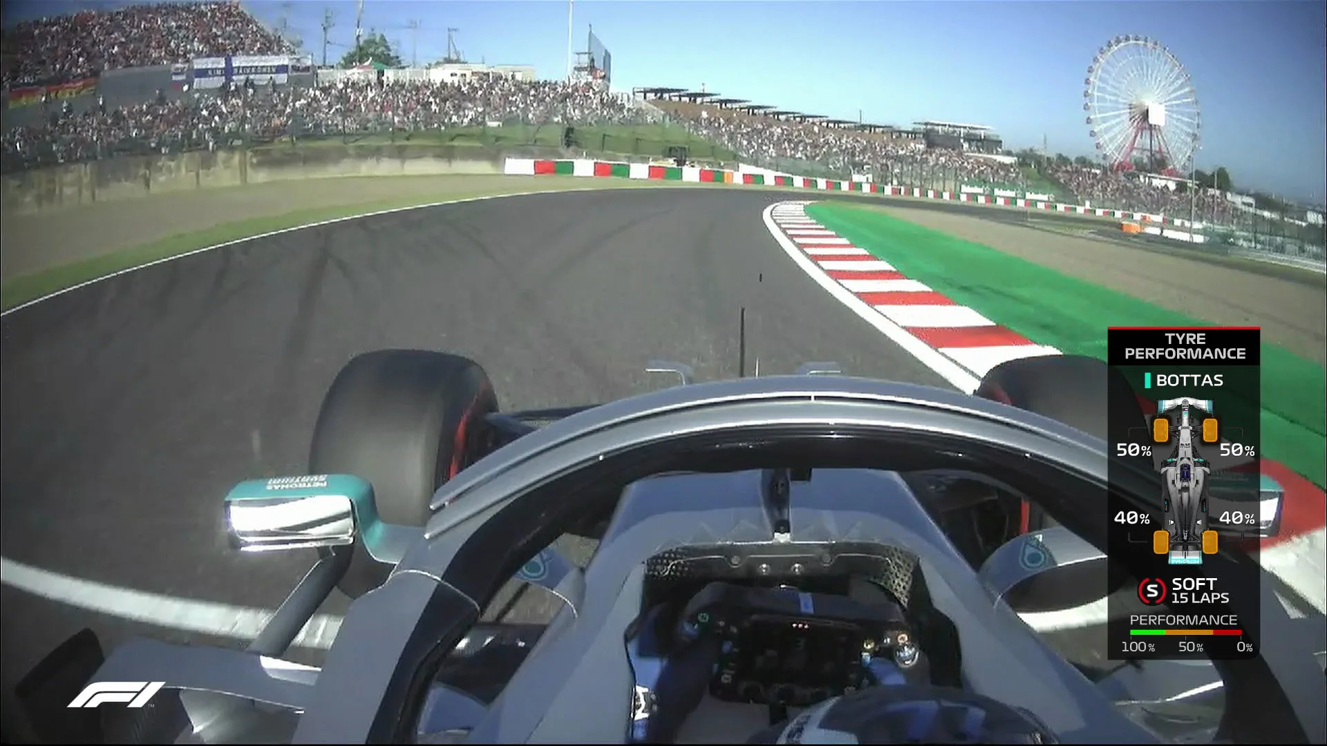
The latest in the F1 Insights series, powered by AWS, the graphic (which was soft launched in Japan) provides insight into the current condition of any car’s tyres, in terms of relative performance.
How does it work?
The graphic is created by analysing timing and telemetry information and estimating lap time lost due to tyres, whilst concurrently calculating single tyre energies. This provides the viewer with a more accurate understanding of a tyre condition’s effect on performance.
How? Well, the Tyre Performance graphic provides detailed real-time information on the current condition for all four individual tyres on a chosen car, presented as a percentage value. The scale runs between ‘new tyre with no wear’ (100%) and a ‘used tyre’ at the end of its effective performance lifespan (0%)
The percentage value indicates how much of the tyre performance capability has been used thus far in a stint. This value is not to be confused with tyre wear which instead refers to the amount of actual rubber removed from the tyre during the usage period. Lower values indicate a proportional loss in tyre performance via tyre degradation.
What other insight does it bring?
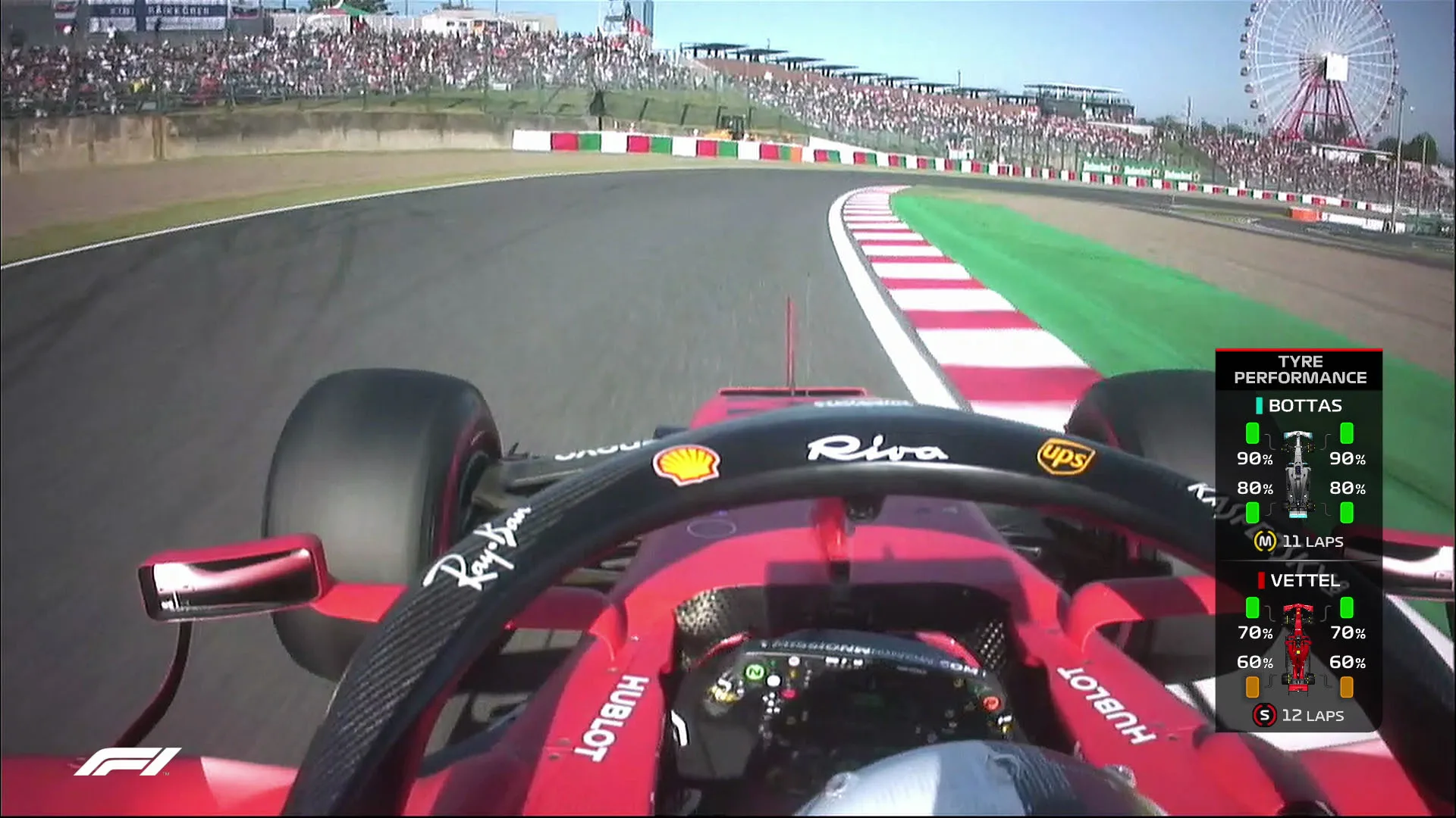
The graphic will also provide an insight into key race moments as well as a longer term view on tyre management. This includes the relative tyre performance difference between two cars locked in a battle and the implication of one car having to stop sooner than another, thus effecting race strategy outcome.
An emerging picture over the season of which cars are lighter on tyres than others, will allow the fans to become more immersed in not only the general conversation but also how particular battles could play out.
What data powers it?
There is a variety of public data from a number of different sources that the Formula 1 team gathers in order to build the graphic and deliver the insights to fans in an engaging and digestible format.
This includes live race timing data (including lap, sector and mini-sector times for each driver), live telemetry data from all cars, tyre compound, stint length and total laps completed on each set, track status and marshalling information, weather information.
This new stat is delivered direct to broadcasters, via the Formula 1 International Feed, enabling commentators to give viewers added analysis into one of the key performance indicators throughout the race..
The Tyre Performance insight will also provide a useful supplement to the current ‘Battle Forecast’ graphic, helping to understand the difference in performance between two cars by providing further key insight into this important aspect of an emerging battle.
Next Up
Related Articles
 What the teams said – Friday in Hungary
 Leclerc predicts ‘tight’ Hungary contest after strong start
 Russell opens up on title fight struggles in Hungary
 AS IT HAPPENED: All the action from FP1 in Hungary
 Hamilton beats Leclerc to top spot during FP2 in Hungary
 Newey gives initial verdict on Aston Martin’s update package