Rob Smedley on Car Performance Scores and the data behind the latest F1 Insights TV graphics

Depending on your viewpoint, Formula 1 is either an elegantly simple sport – where the fastest driver gets the biggest trophy – or one of the most complex, with multi-million dollar cars with tiny nuanced differences between them pulling huge G-forces and lapping at enormous speeds, all while spitting out reams and reams of data.
But for Formula 1’s Director of Data Systems Rob Smedley – a veteran of 25 years on the frontline in F1 with the likes of Ferrari and Williams – marrying those two disparate viewpoints is where you get the really good stuff in F1. And it’s what he’s tried to achieve in a series of new graphics developed alongside Amazon Web Services (AWS) which fans will be treated to throughout the 2020 season – starting with the launch of the innovative ‘Car Performance Scores’ graphics at the season opening Austrian Grand Prix on July 3-5.
READ MORE: F1 set to debut new TV graphics in 2020 with car performance, driver comparisons and more
“The overriding goal has always been the same, since I personally started working with Formula 1,” says Smedley, “which was to bring some of the excitement and engagement of using data to bring a lot of the racing and Formula 1 scenarios to life. They just help to illustrate, in really basic terms, a really, really complex situation, and I think if you've got that level of insight, then that level of insight causes excitement which causes engagement. It keeps you kind of hooked in, because you just understand a little bit more about it.”
While the ‘F1 Insights with AWS’ graphics to date have already allowed fans to see data that was previously only seen by the teams themselves – corner exit speeds, for example, or pit strategy battles – for 2020, Smedley and his team are taking it up a notch, with six graphics to be introduced showing car performance data, driver rankings, a comparison of the qualifying speeds of current drivers to the greatest of all time, high and low speed corner performance, teams’ development throughout a season, and qualifying and race predictions.
“Formula 1 is such a complex sport, in as much that there's so much, what I always call, ‘off-the-ball activity’, which is even more important than the ‘on-the-ball activity’,” says Smedley. “The ‘on-the-ball’ is the bit that we see on our linear feeds, watching one or two or three of these cars going around the circuit together, but there's a lot of other stuff which is always happening, and which is quite often, in order of magnitude, more important at times than the stuff that you're actually watching.”
READ MORE: How to make the most of F1 TV Pro when the racing action begins next week
Turning data into graphics
So what’s the actual process for turning raw data coming off the 20 F1 cars circulating around into an easily-digestible graphic? Each car has over 300 sensors, creating 1.1 million telemetry data points per second. For Smedley and his team – which includes a number of ex-F1 team members – their job is to then mould that data using AWS’s systems into a meaningful representation of a given factor: whether a car is oversteering or understeering, say, or how well it’s going through slow and fast corners.
“We get the data off the cars,” says Smedley. “We 'clean' that data [removing or correcting any anomalies from it] and then we run it through models. We build these specific… mathematical and physical models, based on maths and physics, then we pump out the processed numbers into the system, and then they eventually end up on the TV screen.
“We knock the models themselves out in a matter of – it might be a two-week period or something like that, and then it's a case of building the graphics and integrating the data streams – so how we can actually get the data off the cars processed and then onto a TV screen.”
READ MORE: 5 headline-grabbing rivalries set to dominate the 2020 season
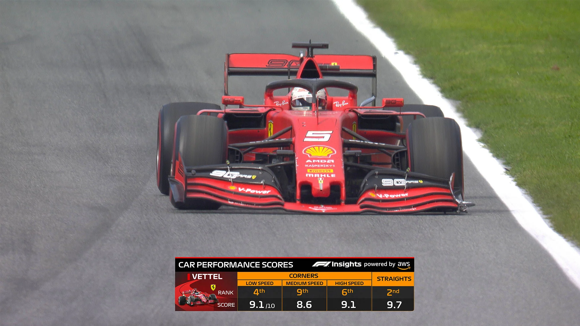
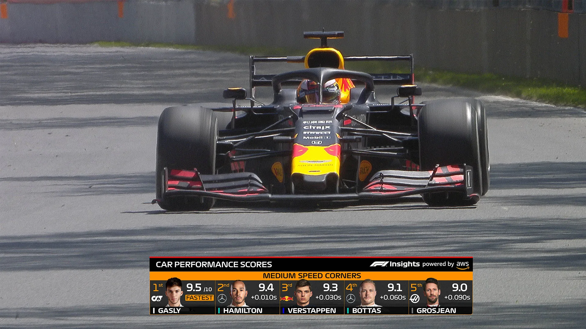
How Car Performance Scores work
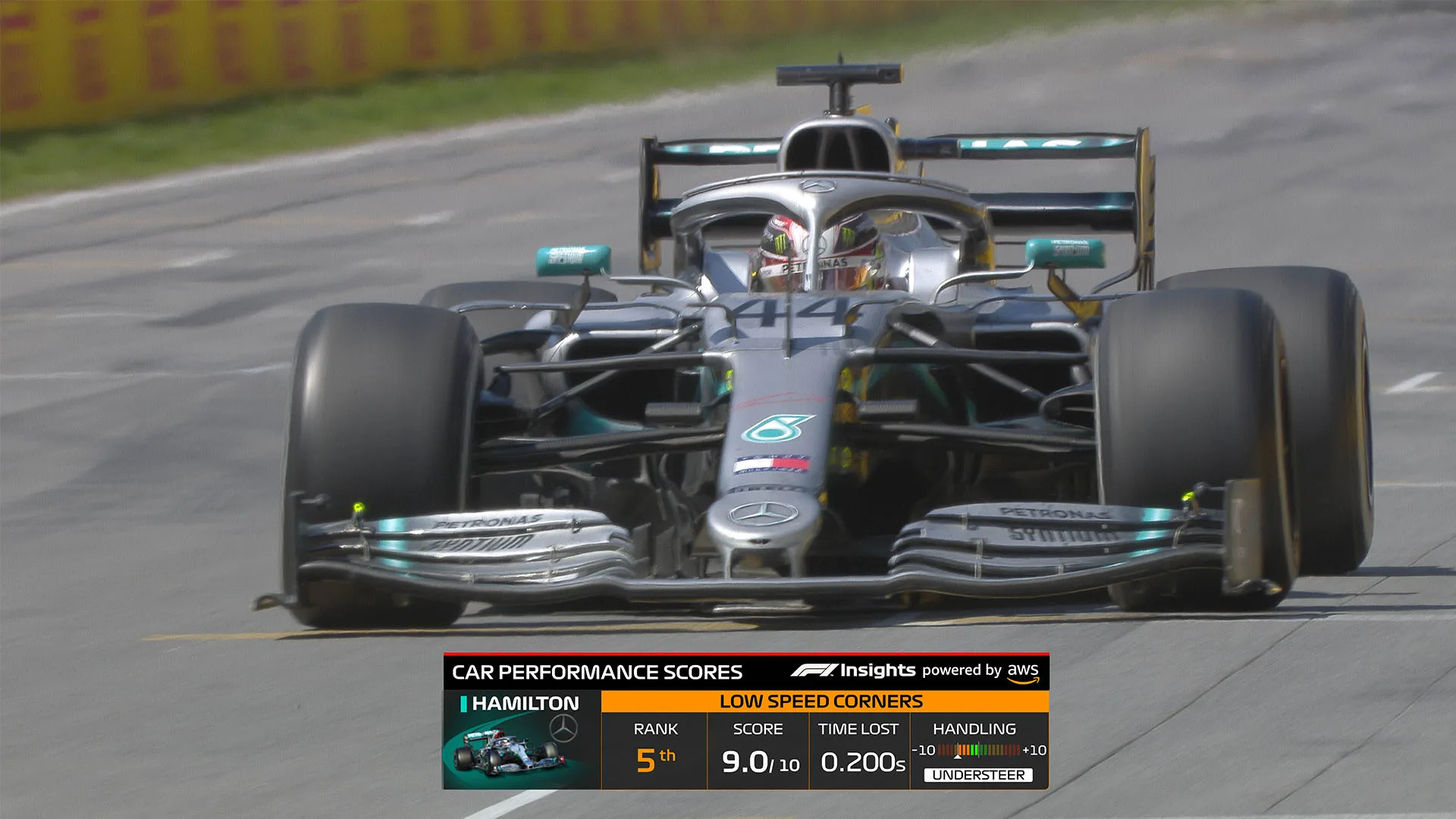
As you’d imagine, the maths and physics behind some of the graphics is, for a layperson, complicated. The ‘Car Performance Scores’ graphics will show how cars are performing in high, medium and low speed corners, which is fastest on the straights and which cars are oversteering or understeering.
Smedley and his team use various bits of telemetry from the cars – including lateral acceleration, car speed and other parameters – to dissect up the circuits on the F1 calendar into their constituent parts: low, medium and high-speed corners, as well as straights. From there, they can then measure how long a driver is spending in each of the sections – and in doing so, establish both a driver’s and car’s performance in those sections, shown on the graphic as a simple score out of 10.
READ MORE: AWS's Tyre Performance Graphics explained
To establish the oversteer and understeer levels of cars going through a corner, meanwhile, required Smedley and his team to build a model to work out the tyre slip angles at the front and the rear of the cars, taking data from gyro sensors and measuring it against the angle of the corner. The resulting equation, for a non-engineer, is enough to set your brain swimming and bring back painful maths exam flashbacks – although reassuringly, that car handling information is then shown on TV screens as a simple -10 to 10 score, -10 being a super understeer-y car, 10 being an oversteer-y one, with 0 representing a mythical F1 car that is perfectly neutral.
The beauty of engineering and maths and physics is you build massively complex situations, but you boil them down into a really elegant solution that everybody can understand
But did Smedley ever worry that, for your average F1 fan, all this might get a bit too technical?
“The models are highly complex in some cases – and I think that's the beauty of it,” says Smedley. “It's then working with colleagues within Formula 1 to kind of present that in a way that's readable. The complexity should be there –there's no point having something which is really overly-simplified and doesn't really tell a story. I think we've got to be doing things which are clearly telling a very, very complex story.
“But that's the beauty of engineering and maths and physics, is you build massively complex situations, but you boil them down into a really, really elegant solution that everybody can understand, that everybody looks at and goes, ‘yeah, I understand that.’ They might not understand the underlying maths and physics, but they understand what the outcome is, and it tells them a story that engages them into the Formula 1 race.”
READ MORE: Can any of last season’s midfield teams make F1’s ‘big three’ the ‘big four’ in 2020?
Bridging the gap between the pit wall and the sofa
Smedley departed from F1 ‘team life’ at the end of the 2018 season, when his tenure as Head of Trackside Operations at Williams came to an end. So was part of creating these graphics born out of his frustration at watching F1 sat on the sofa at home, without banks of data monitors in front of him?
“You know what, it's a bit of a strange one but I never really got that,” he says. “But I was told that by ex-colleagues, and the two principle people who told me that were Ross Brawn and Pat Symonds, because they had spent a period of time watching Formula 1 at home, and never really being able to understand.
“When I started to consult and help Formula 1 understand what angle it wanted to take on sporting data… I actually had all that information, so I've never really had to sit through Grands Prix at any point in my life trying to understand what's happening, when the only thing you're actually looking at is a car going around on a track. But I can totally imagine that that would be incredibly difficult.”
READ MORE: 2019 was Vettel’s best season in F1, says former Ferrari man Smedley
The new ‘F1 Insights with AWS’ graphics will be drip-fed to fans across the 2020 season, with Ultimate Driver Speed Comparison – comparing the current drivers’ qualifying speeds to some of the greatest of all time, using data going back to 1983 – the next to see the light of day, at the 70th Anniversary Grand Prix at Silverstone on August 7-9. But of all the graphics that he’s helped to develop for this season, did Smedley have a favourite?
“There isn't a particular one to be honest, because at some point, they're all really useful and all really engaging,” he says. “If you take certain scenarios, it's really exciting to understand, at that point, one thing, but then if you take a different scenario like post-qualifying, you might want a different bit of information.
WATCH: How the cars have changed in 70 years of F1 innovation
“So I don't think that I would choose one over any of the others; it’s having that suite of knowledge that you can then say, ‘this is something that's really important for me to engage in at this point, do I have a tool, do I have an application or a graphic that is going to be able to give me more insight into that?’
“As an engineer who's spent 25 years sat on a pit wall, I can attest to how important having visibility of that data and that process data is, because it's telling you the background story and informing you of the way that this particular scenario can play out, and therefore what the decision points and the waypoints are along the way, so you're much more engaged in the whole thing. And being engaged in it to that level, you're gripped by it. It just makes the whole thing much more exciting. And that's what we're trying to do with these AWS graphics.”
Find out more about Formula 1's work with AWS here
Next Up
Related Articles
 BettingFinal Hungarian Grand Prix predictions and latest odds
 Hamilton braced for ‘damage limitation’ in Hungarian GP
 Hulkenberg concerned by ‘bigger gap’ to rivals in Hungary
 Slater beats Ugochukwu to F3 win and title lead in Budapest
 Leon claims maiden F2 Feature Race win in Budapest
 Sainz explains why he was caught out in Piastri clash